Sunday 13 May 2012

"Photobooth" by Babbette Hines (2002)

Hines' beautifully nostalgic book, containing nothing but images taken in photobooths, led me to consider the state of the subjects during exposure in this way. The majority are alone in that small space, isolated from the outside world for just a few seconds. This appears to give them a sense of freedom to do what they want, to be portrayed in a way they alone want to be seen.


With the vision and instruction of a professional photographer removed, these images often provide us with a clearer insight of the sitter's character, in a far more intimate setting.


Since this publication's release in 2002, there has been a noticeable increase in the use of the photobooth in modern media, with users craving the sense of nostalgia and lack of pretension which images of this type entail. For example, this music video by rock band The Dead Weather, demonstrates the contemporary use of the photobooth, as well as the freedom of expression encountered when utilizing it.


"Hang You From The Heavens" - The Dead Weather, 2009


"Indeed, the sitters are orienting themselves towards a future, composing themselves (in fact, they are gauging their own reflections in the pane of glass that intervenes between themselves and the camera), beholding themselves, looking at how they will be seen. They try on this pose and then that...addressing first themselves (there in the mirrored glass) and beyond that the intended other (girlfriend, boyfriend, parent, sibling, penpal, bureaucrat), but beyond that, well, something like the undifferentiated future - the faceless prostperity - us!" - Babbette Hines 

Friday 11 May 2012

Dale Chihuly's Glass Sculptures

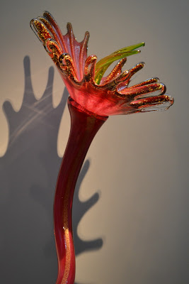
Diverting from photography for a while, I couldn't go without posting about the beautiful glass-work sculptures I encountered at the Halcyon Gallery in London. Built by Dale Chihuly, these pieces are truly awe-inspiring, creating a peaceful and fairytale-esque feel within the space. 


Here are some photos I captured of Chihuly's work - 


Chihuly's love for vibrancy and nature shows through in his many botanical sculptures. In the photo below, you can get a feel for the detail within these, as flecks of gold highlight the shape of each glass petal.


To view a short video on the opening of the show, as well as the gallery itself, click here! http://www.halcyongallery.com/news/dale-chihuly-opens-new-halcyon-gallery-144-146-new-bond-street

Tuesday 1 May 2012

Orlan's Controversial Art

French performance artist Orlan designs pieces based around the developments of her own body through constructive surgery. Here are my thoughts on her graphic and controversial works -


I find Orlan’s ideas about changing the “ways to think about one’s body and one’s beauty” interesting, as through this work we find questioning what we ourselves find beautiful. While doing so, she puts forward ideas about how culture - be it paintings, photography, music, cinema, etc – are able to so easily change who we are, whether we're aware of it or not.
However, she obviously takes this to the extreme by physically & permanently altering her appearance through surgery, or later on, through the digital manipulation of her own face. While her message is valid, I don’t believe this means of communicating it is at all necessary.


http://www.guardian.co.uk/artanddesign/video/2009/jul/01/orlan-artist-interview


During an interview with the Guardian (shown in the link above), Orlan seems to place far too much emphasis on the fact that she was the first artist to venture into this sort of work, which makes me wonder whether she just disguises an incredibley extrovert publicity stunt as art; just a way of spreading her name around, and provoke discussion of her work purely due to it’s controversy.


Personally, I believe that this work’s intended message is over-looked purely because it is so shocking. Does it need to be this extreme? Would viewers have a clearer understanding of the work’s message if they weren’t simply blinded by how shocking (& sometimes disturbing) Orlan’s artworks are?

Monday 30 April 2012

A Question Of Ethics - "Photography & The Law"

"Heads", a series spanning from 1999-2001, documents unaware members of the public in New York's Times Square. The artist behind the project, Philip-Lorca diCorcia, who was sued for financially profiting from one pedestrian's image without their permission, prides himself on recording his subject's unknowing expressions as they go about their day-to-day lives. 


As a response to an online discussion forum set up by the university concerning the controversial work of Philip-Lorca diCorcia in his project "Heads", I wrote the statement shown below - 


"On the whole, when taking photos in a crowd or on the street, I do, 90% of the time, tend to ask people's permission before I take their image, however daunting that may be. This is obviously the more ethical option, and I know if I was having my photo taken by a stranger, I'd certainly like to be aware of it, and to know what it was being used for.

Of course, having said this, by not telling those you are photographing I feel you can capture the subject's subconscious emotion; the expression on their face would reveal far more about that person than the forced smile or pose they would adopt when a camera was directly pointed at them.

As several of my fellow students have said, I think a more ethical way around this issue is to approach the subject after the photo has been shot and show it to them, explaining the reasons for your shooting, the intended use of the image, etc. That way the person is still able to have their say & give permission. 
However, this too has it's problems. If you are shooting, for example, using film or in a busy, bustling area, it would be impossible to talk to each of your subjects, or show them their image.


I think this is going to forever be one of photography's many unresolved issues."

Monday 23 April 2012

A Look At The Work Of Dara Scully

22-year-old Swedish photographer Dara Scully specialises in the surreal. Her self-portraits have a fairy-tale air about them, as they often depict her within rural settings, surrounded by anthropomorphic animals. The soft focus and natural light of her photographs gives them a dream-like quality, along with their subdued colours and whimsical subject matter. The themes of freedom and escapism run throughout her work, both in the physical and metaphorical sense.


Remaining within the realms of surrealism, Scully's photographs sometimes take a morbid turn, as throughout her project "Escaping From The Wolves". For example, a sense of unease is felt within the viewer upon looking at this picture from the series (below). Here, we can't see what she is running from. All we know is the darkening clouds and ominous mountains in the background appear to be chasing her.


A project of hers I found particularly interesting is "Bluebird's Heart", wherein Scully appears to play with the idea of death. Life after death is also referenced heavily here, as the bluebird leaving the cage in Scully's supposedly lifeless chest, represents the freedom and continuation of the soul. 


For more information on Dara Scully, visit her website: http://cargocollective.com/darascully

Wednesday 11 April 2012

Viewer Or Voyeur?

Below are my thoughts on the morality of photography as a means of reporting violent world events. Are the images we see in the media too graphic? Or are they necessary in our learning about the world?

When Colonel Gadafi was executed, I remember seeing scenes on the news & in the papers of his bloodied body being dragged through the streets. Despite the gravitas of that situation, I’m not sure the graphic nature of the images chosen to depict the event in the media can really be justified. Seeing that image plastered on the internet, across TV channels, and along the newsstand shelves at the local corner shop really shocked me and stuck in my mind. But then again, I suppose that was the idea...


After watching a documentary about war photographer Don McCullin, having heard him talk about the “darkness” in him, and his experiences having “left him with an untrustworthy outlook on humanity”, I can’t understand how someone could subject themselves to sights such as this without coming away mentally scarred. I personally couldn’t do it.


McCullin remarks on his days as a war photographer "I'm not what you'd call clean...there were moments when I was excited about it, which was totally wrong." Does this make him a voyeur?

Having said this, I have to admit that while reading this 2010 article from the Guardian (below), regarding the media's coverage of the stoning of a man in Somalia, I felt compelled to seek out the mentioned images for myself. This doesn’t, however, mean I enjoy viewing them. There is a certain thrill, an adrenaline rush, when you see something out of the ordinary. It is the same horror movies and roller coasters are so popular.


http://www.guardian.co.uk/artanddesign/2010/mar/08/world-press-photo-sean-ohagan

In the long run, if you remove the camera from the situation, such as this brutal execution in Somalia, it isn’t going to stop it. So, in one respect these images are merely bringing issues such as war, execution etc into the light. They show viewers things they would not know existed otherwise, who are then able to see the truth about the world and voice their opinions on such matters, but not, necessarily, be directly effected by them. 

Tuesday 3 April 2012

Lenscratch "Animals" Launch!

Having been following the well-known photography blog ‘Lenscratch’, I recently noticed there was an opportunity to take part in several online exhibitions. I chose to enter this image (below, entitled "Eye To Eye") into the exhibition entitled ‘Animals’, in an attempt to spread my work more widely around the web!


Having successfully submitted it, yesterday brought about the launch of "Animals". Myself and several of my fellow students were lucky enough to have our work shown!


Visit Lenscratch here! http://www.lenscratch.com/

Monday 2 April 2012

Guest-Speaker Rasmus Vasli's "Photographing Strangers"

Artist Rasmus Vasli conducted a lecture describing his work with portrait photography. He explained his haphazard technique of going on walks with his camera, no concept in mind, and simply shooting portraits of people he'd see on the street, having spoken to them and asked their consent.
"A Proud Man"


I really like this style of shooting, because although it's not entirely natural - the subjects are still very much aware of the camera's presence and so somewhat pose - the lens captures them in a freeze-frame of their everyday lives. They have no time at all to prepare how they will look, and are captured within their normal surroundings with natural light, as opposed to in a studio set-up. 


In his blog, entitled "Cup Of Pea", Vasli accompanies each image with a short caption about what he learnt from talking his subject. This is the only contextual information we directly receive. Otherwise, it is up to us to determine the character of each photographed person, drawing ideas from their surroundings, clothing and expression.


"Derek"

For a better look Rasmus Vasli's work, here is the link to his blog "Cup Of Pea" -
http://cupofpea.blogspot.co.uk/

Tuesday 20 March 2012

Guest-Speaker Marcio Mascarenhas

We were lucky to have Brazilian photographer Marcio Mascarenhas visit Solent today, who gave a presentation on his portraiture work. 
In his project "I is an Other", Mascarenhas attempts to depict the different pieces of someone's personality, the many aspects of their character - we are never just one person; we are changeable. 


As he stated "You don't exist if no one is there to see you", I realised how the dependence upon another to reveal your own self is important in our society. 


Mascarenhas goes down a similar route with another of his projects, entitled "The Bodies I Live In". This too outlines his ideas on identity, but now places an emphasis on gender and race in each frame.


For instance, in this image, the female subject is shot firstly in a way that highlights her feminine figure, with directional lighting picking out the curved shapes of her body. However, her lower body has been interjected by a far more masculine frame.
Although the parts of this piece do not necessarily match up, our subject remains consistent, as does her sense of vulnerability, with her hands folded across her body in each part of the photograph. This could reflect the fragility of the human personality, as well as the way in which we are all so susceptible to change. 
The way these large-scale photographs are presented - each of them cut up and placed against further images of the same subject but from a different perspective - refers, again, to the many personas we adopt throughout our lives. 

Wednesday 14 March 2012

Taylor Wessing Portrait Prize, National Portrait Gallery

The Taylor Wessing Portrait Prize showcased a shortlist of sixty photographs taken by a wide range of talented, albeit lesser-known photographers, many of which have stuck in my mind. This image of Dolly Parton, taken by Zed Nelson in 2011, is one of those.


Being one of the few photographs within the show portraying a famous subject, I believe makes this image even more poignant. So used to seeing her within the context of the glamourous lifestyle of a singer, we now witness a quiet, almost fragile woman, complete with contemplative expression. Parton's unawareness of the photo being shot, allows us to see a different side of her character. 


Another image I found particularly compelling is "Erika E. Born In 1910" (below) by Karsten Thormaehlen. Taken from a series called "Happy At One Hundred", this image has an air of dignified positivity radiating from it; a quality little-found throughout the rest of the exhibition. I love the detail of each line upon the subject's face, along with the slight smile upon her lips, each giving viewers a sense of her character.


Similarly, "Anna and Roberto At Home" by Claudia Burlotti, I believe should have been one of the winning portraits from the whole exhibition. This heart-warming image, capturing a loving moment between the photographer's grandparents, depicts genuine emotion caught spontaneously on camera. 


Unlike the winner of the Taylor Wessing prize, I feel Burlotti's photograph depicts the raw emotion that a reliable portrait should encompass. Here, you are able to learn something about the relationship between the subjects, whereas in Jooney Woodward's "Harriet & Gentleman Jack" (The winning portrait, shown below), this attribute is somewhat lost. 


For more information on the Taylor Wessing Portrait Prize, as well as other exhibitions, take a look at the National Portrait Gallery site - http://www.npg.org.uk/

Giorgio Ciam, Mummery & Schnelle Gallery

During a trip to London, I visited the lesser-known Mummery and Schnelle Gallery. Here, I discovered the work of experimental photographer Giorgio Ciam, who produced blurred images through the movement of his subjects and a long exposure. This is in order to obscure the identity of those in his photographs who, I learned, are often the artist himself with a friend. 


This work is reminiscent of that of Francesca Woodman, whose well-known images were produced through similar processes to Ciam's. 
Using long exposures, Woodman's work (shown below) depicts the troubled artist in a series of disturbing nude self-portraits created in the lead up to her eventual suicide in 1981. In the majority of her images, it is evident that the artist is trying to hide away from the lens, to blend into her derelict surroundings, thus resulting in a type of "anti-portrait" in which the subject cannot always be seen. She achieves this, again, by using movement and blurring, as well as objects within her setting - such as peeling wallpaper, furniture and large photographs - to hide behind.


Although eerie and subsequently tragic, I find this work rather beautiful, with the surreal effect of long exposure giving them an ethereal quality.  


Wednesday 7 March 2012

Sophie Rickett's "To The River" at The Arnolfini Gallery, Bristol

As I entered the dark hall in which Rickett’s work was showcased, I felt completely enveloped by it. The atmospheric whispers of the viewers of the Severn Bore - a wave that rarely runs down the length of the River Severn - filled the room, coming from a total of twelve speakers dotted throughout. This was accompanied by several large screens (one shown below), upon which were shown clips of the spectators waiting on the river bank at night. Despite being the main reason for the subject's presence, there is very little emphasis on the landscape, with the bore never actually being filmed. Instead, the focus is placed upon the anticipation of the crowd in relation to this natural phenomenon.   


This was quite a surreal experience; standing in a large dark room, surrounded by others, wondering if it was the voices of the subjects I could hear or those of my fellow students. In this sense, the show is completely immersive, making you feel like you are among the group of excited bystanders.   


Spectators in the darkened space of Rickett's "To The River"

Tuesday 6 March 2012

Shilpa Gupta at The Arnolfini Gallery, Bristol

As interesting and awe-inspiring as Shilpa Gupta's creations were, I found the pieces were just too different from each other. Each work seemed to stand on it's own, delivering it's own message. Using a range of mediums including photography, sculpture and sound, Gupta addresses the diversity of modern culture, emphasising the impact different media sources have on our understanding. 


"Singing Cloud" (2008-9), a huge suspended form made up of 4000 microphones (some shown above), remains the most memorable part of the show. Hung in a darkened room, the ominous cloud's microphones have been redesigned to emanate sound, rather than register it. As the sound travels over the sculpture in ripples, these words, sung disjointedly by the artist herself, can be heard -


I want to fly,

High above in the sky


Don’t push me away

We shall all fly
High above in the sky

I want to fly high above
In your sky

Can you let it be
Only your power
And not your greed

A part of me will die
By your side
Taking you with me

High high above
in the sky

While you sleep I shall wake up and fly

To be honest, as impressive as this sculpture was, I believe it's meaning (which I struggle to comprehend) gets lost behind it's presentation. 


For more information about Shilpa Gupta, visit her website: http://www.flyinthe.net/index.htm

Monday 27 February 2012

A Review of David Cotterell's "Monsters Of The Id" show at the Hansard Gallery


This has to be one of the most surreal , and eerie, gallery shows I’ve seen for a long time. David Cotterell’s “Monsters of the Id” show, comprised of several large installation pieces, is completely interactive, allowing viewers to survey the war in Hellman Province, Afghanistan, from multiple perspectives. However, this is not depicted in it’s typical “war-torn” state we are so used to seeing in the media. Instead, focus is placed more upon ideas of surveillance & our relationship to our surroundings.

The first piece to be seen, near the entrance of the gallery, is featured as a projection on a large curving wall. As viewers sit on the bench placed in the centre, facing this wall, sensors recognise their presence and create life-size figures that appear within the projection and seem to stare out at them. The more people present in this room, the more figures will appear.
This installation has the same affect on a later piece; a gallery-length model of a desert landscape, again with a projection laid over the top of it. Here, the projected image shows large groups of people from a birds-eye-view perspective.
I found this piece to be the most thought-provoking, as it prompted ideas of the insignificance of a human’s impact on a vast landscape. It also brought up issues of constant surveillance & being watched – you can’t expect privacy anywhere nowadays, not even in the middle of a desert!


Another section of the show featured a darkened room, lit by a single lamp on a desk, set up as a supposed military base. A computer screen, flashing with statistics, was also placed on the desk, across the room from a tent made of camouflage fabric.
This piece, I felt, didn’t fit with the rest of the show, due to its immediate lack of advanced technologies. However, after reviewing the exhibition as a whole, I now feel this room was designed to  fully immerse the viewer, in yet another way; from observing on the desert floor as figures pass you, to  hovering in a drone above the scene, this setting forces you to actually become involved in the war scenario.  

To conclude, as thought-provoking and enveloping as this show was, I feel it was more a demonstration of these new interactive technologies than anything else. The idea of war begins to get lost behind the work’s complex delivery, which I think is somewhere unnecessary.
Saying this, Cotterell’s intention of making viewer’s question their sense of presence was highly successful; we are either involved with or removed from the scene, and can only have so much control over it. We apply this idea to our own lives, and realise we sometimes have to strive to maintain our privacy. 

Thursday 23 February 2012

Researching the "Anti-Portrait"

Studying the work of Giorgio Ciam and Francesca Woodman has prompted me to look deeper into the world of the "Anti-Portrait". Through this, I have come across several methods artists have employed in order to remove themselves or their subjects from an image while still communicating information about them. 

In doing so, I explored the work of Lee Friedlander; a photographer who incorporates himself, sometimes comically, into pictures of his surroundings using largely his shadow or reflection. The following quote from his book "Self Portrait" (1970) I feel sums up the way he operates well: 

"They began as straight portraits, but soon I was finding myself at times in the landscape of my photography." - Lee Friedlander

Despite his body not present in the frame, Friedlander is very much a part of each image, with his shadow or reflection often causing an ominous distraction from all else within it. His style also reveals, as a portrait should, aspects of his personality. For example, (below) the first photo demonstrates a certain lightheartedness while he tries to make his shadow sit in a chair, whereas the second can almost be called voyeuristic, as he follows a woman down the street. 


Monday 20 February 2012

Metaphor & Allegory

This week's lecture was based on the ideas of metaphors and allegories, and how these can apply in photography.


Metaphor - An implicit, but not literal, comparison.

Allegory - A hidden meaning within a text or image.

The main focus of this discussion was two images by feminist photographer Sarah Lucas, with the first of these entitled "Self Portrait With Fried Eggs" (1996). This depicts Lucas seen in a typically masculine position, photographed from a raised viewpoint as if we are looking down on her to indicate a sense of vulnerability. More notable are the fried eggs on her chest to represent her breasts, which can arguably signify ideas of female objectification and motherhood. 

From her defiant masculinity and feminism down to the cigarettes placed on the floor, this image appears to be all about the choices we make in life, and how often we are judged because of them.


The second photo we studied was "Au Naturel" (1994); a crude metaphor, made up of inanimate objects symbolizing the reproductive organs of a long-married couple. It communicates Lucas' feminist thoughts about the degrading effects of age and marriage upon the female subject, and the constant "readiness for sex" shown from the male.  


During a further discussion of "Au Naturel", we pondered the possibility of prostitution being the main theme of the photo, rather than marriage. This was sparked by the empty room surrounding the sordid mattress, as well as the use of melons and a bucket to stand for the female body. There is nothing personal about the space, and the particular objects used in this case indicate objectification and long-term sexual activity among women. 

Thursday 16 February 2012

Semiotics

This week's topic was semiology; the study of social signs we encounter in day-to-day life. We discussed the various types of symbols we subconsciously analyse and gave examples of signs for roads, restrooms etc. The types of signs are as follows:

  • Non-coded iconic - Information retrieved through pictures 
  • Linguistic - Information retrieved through reading words
  • Coded iconic - The connotations an image carries with it; what further information is triggered by viewing a particular symbol?
Whereas the first two of the above three types tend to mean the same from person to person, the third, we discovered, often differs due to the interpretation of the viewer. The individual's past experiences will have an effect upon how an image is perceived, and what they associate with it.
To further our understanding, we watched Johnny Cash's haunting music video for song "Hurt", analysing it first without the sound, then secondly with. The effect this had was to remove any lyrics that indicated meaning to the imagery, then afterwords, to view the sequence of images with their context.


If I apply the above three codes to this poignant music video, these are my personal results -

  • Non-coded iconic - Imagery related to aging (showing him young), religion (Jesus on the cross), vanitas paintings 
  • Linguistic - Lyrics tell of his regret ("What have I become?"), his memories of loved ones
  • Coded iconic - Closure (closing of the piano, music building & then ending abruptly), loss of loved ones (portrait on the wall) 

Saturday 11 February 2012

Charlotte Cotton on Tableaux Photography


Through studying a chapter of Photography critic Charlotte Cotton’s book “The Photograph As Contemporary Art”, I developed a greater understanding of the concept of Tableaux Photography. This, I discovered, is the practice of constructing every aspect of an image before it is captured, in order to make the staged appear real. For example, Cotton refers to the work of James Casebere who produced the below photo, "Pink Hallway #3" (2000), through building and photographing a miniature version of a hallway from Massachusetts boarding school The Phillips Andover Academy, and flooding it with water. The desired affect of this image, which I believe is achieved, was to spark an unease in the viewer and force them to question the supposed strength of man-made structures.


Through discussion of this work, we came to the conclusion that people often trust and expect to see the truth in photographs, more than they do paintings, and so are often fooled by the technique of tableaux. This quote from Liz Wells’ “Photography: A Critical Introduction” (1996) I feel sums up the key ideas thought about during this seminar -

“We speak of taking photographs rather than making them, because the marks of their construction are not immediately visible; they have the appearance of having come about as traces from the scene itself, rather than as carefully fabricated cultural objects.”

Another artist that operates under this method of working is Jeff Wall. In this photo of his, entitled “Mimic” (1982), Wall has recreated a scene he himself witnessed in everyday life; a white couple making a racist gesture towards a Chinese man as they pass him on the street. The artist, inspired by his memory of this sight, then reconstructed it by employing actors upon a chosen setting but, at first glance, this scene appears genuine and spontaneous. 


Similarly, in his painstakingly-built images, Gregory Crewdson, along with a large lighting crew, fabricate elaborate scenes complete with actors, sets, etc; all the production values of a Hollywood film - just to achieve a single shot. His surreal images, such as the one shown below (from his series "Twilight") which took 11 days to capture, often involve extensive post-production, thus further distorting reality. 


Thursday 2 February 2012

John Berger - "Ways Of Seeing"

The chapter of John Berger's "Ways Of Seeing" we analysed was made up completely of images. It involved the themes of social status in the cases of women, slavery, different races, and varying wealth. The images shown, some photos and some paintings, depict these in varying levels of respect and dignity. The effect of having no text to accompany these pictures, allows the viewer to make their own interpretation of each of them. These interpretations are often based upon the experiences of the viewer themselves, and so differ greatly from person to person.


For example this image, entitled "Woman With White Stockings" by Gustave Courbet, depicts it's female subject objectified, in a position of sexual vulnerability. The detailed and graphic portrayal of this would have been somewhat shocking when it was produced in the 1800's. However, to people viewing it today, having grown accustomed to a new generation of increasingly sexualised media, this painting, although still objectionable when seen through feminist eyes, is not quite so remarkable in that respect.

These are some questions we were given to discuss while studying the extract -
1. Consider why Berger has produced a chapter in a book based solely on images? 
2. What narratives are suggested by this sequence of images? What ties them together? 
3. What are the similarities of the images stylistically and from what periods of of art history do they come from?
4. Following on from this how can readings of these original images change over time?      


While studying this extract from John Berger's "Ways Of Seeing", I found a series of videos, hosted by Berger himself, of the same name -


This, like the extract we analysed, places emphasis on the ways in which our interpretation is effected by what we are surrounded by. In the video, Berger uses the example of paintings, and how they have become so easy to reproduce today. We are now able to see these paintings anywhere - in magazines, on television and computer screens etc - because of their reproduction, whereas we were once restricted to viewing just the original piece in it's initial state and setting. Therefore, the context of the artwork changes, adapting to our own lives; it is now surrounded by what we find familiar and so, to an extent, we associate the painting's circumstances with our own.

Tuesday 31 January 2012

Introduction

Dear reader, 


Having blogged very little before, this feed is a record of my developing understanding of contemporary photography. As a student of BA (Hons) Photography at Southampton Solent University, I intend to write about what I learn and encounter in a selection of posts and reviews, archiving my exploration of the subject I am so passionate about.

I hope you enjoy reading it!


Rachel Broad